Obviously #1
Building a Design Foundation
Starting in 2020, I was Obviously’s first UX designer hire. The nine-year startup focused on influencer marketing campaigns and supporting its custom SASS platform to facilitate these campaigns. The company executes campaigns by finding influencers, managing the content creation process, and collecting analytics on the collective performance of those social media posts. Before I joined, they relied on the Engineering team and occasional freelancers to fulfill design needs.
The Need for Foundation Design
No Consistency
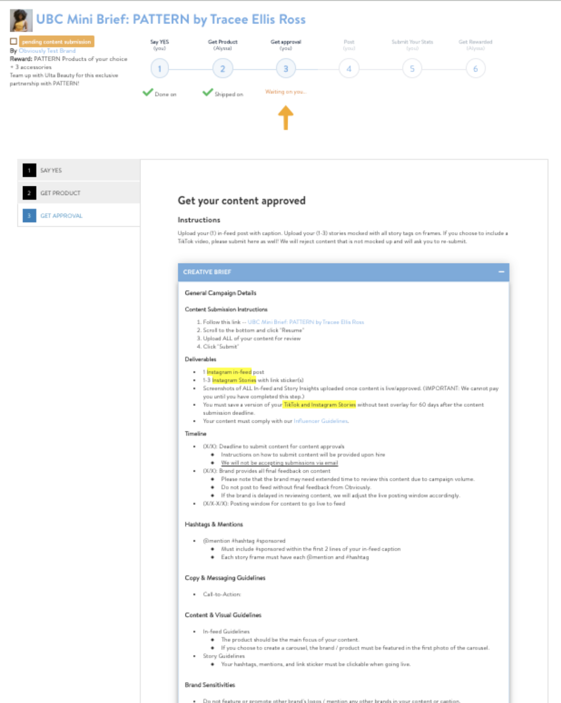
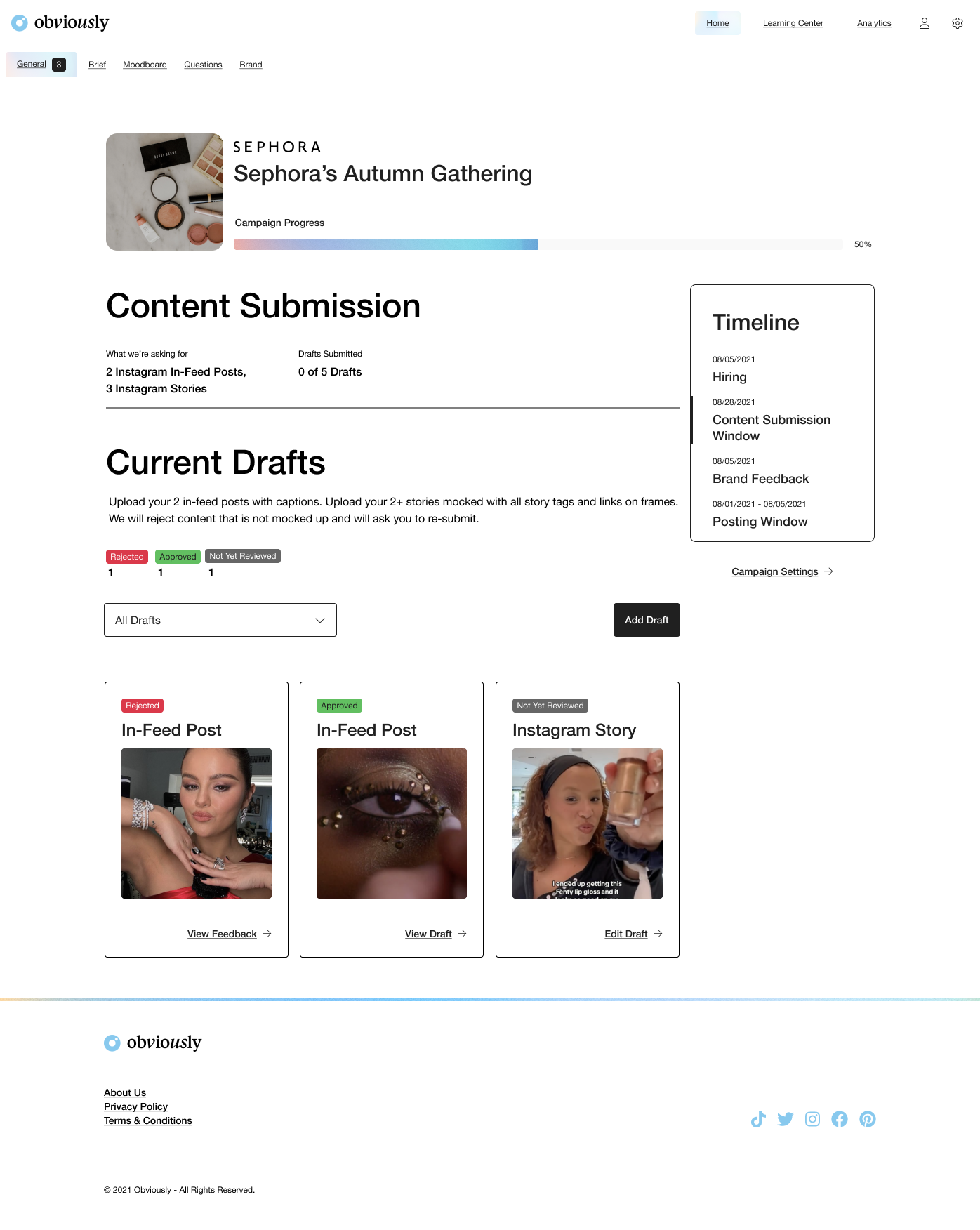
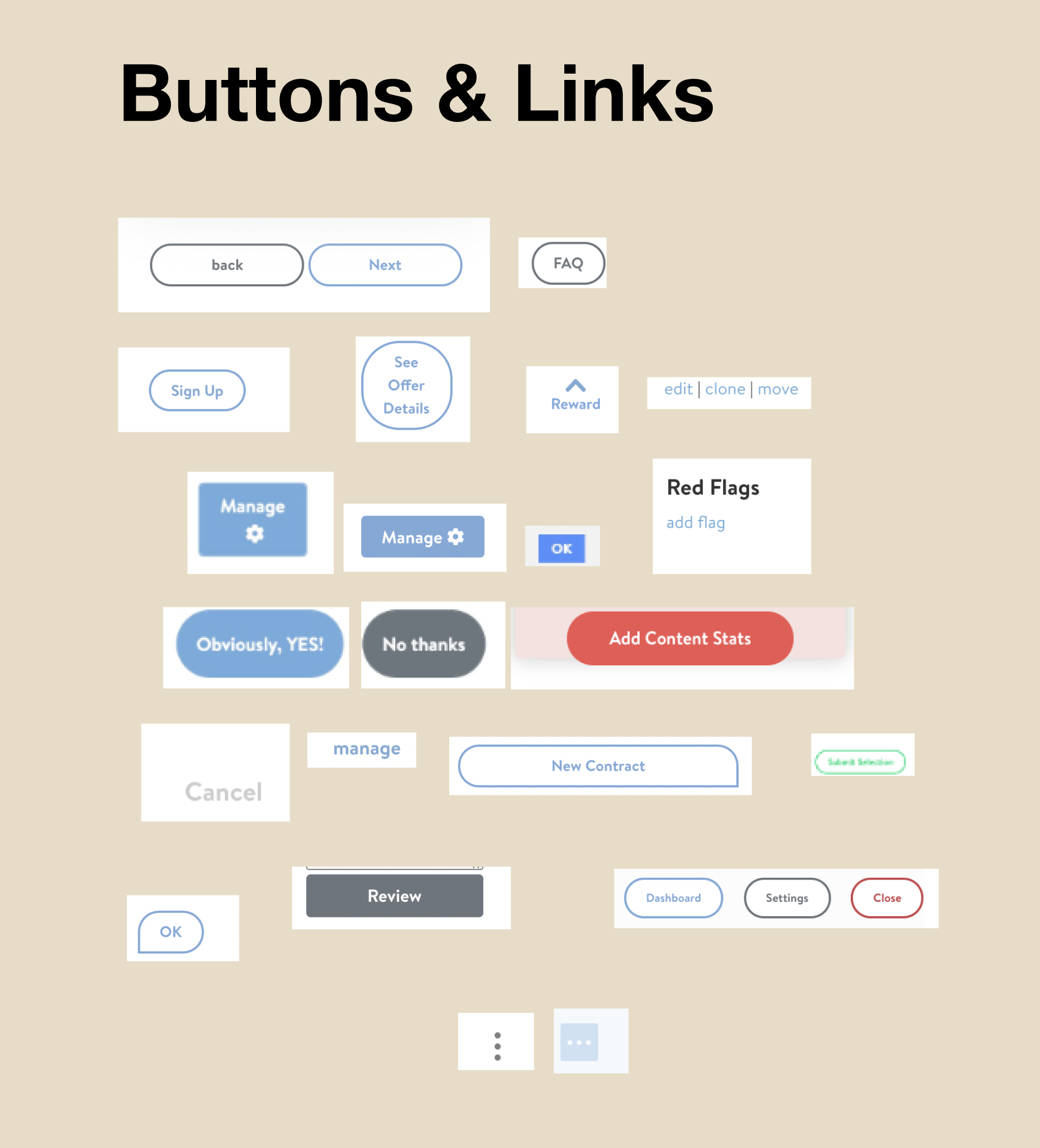
Years of engineer-led design decisions led to hundreds of inconsistencies on the component, page, and architecture levels. Also, half-hearted do-overs of the CSS meant it wasn’t an easy fix.
To tackle this, I initiated a series of phases and activities.
- A complete UI audit of every page.
- Interviews with the Director of Engineering to get the history the UI and CSS front-end stack.
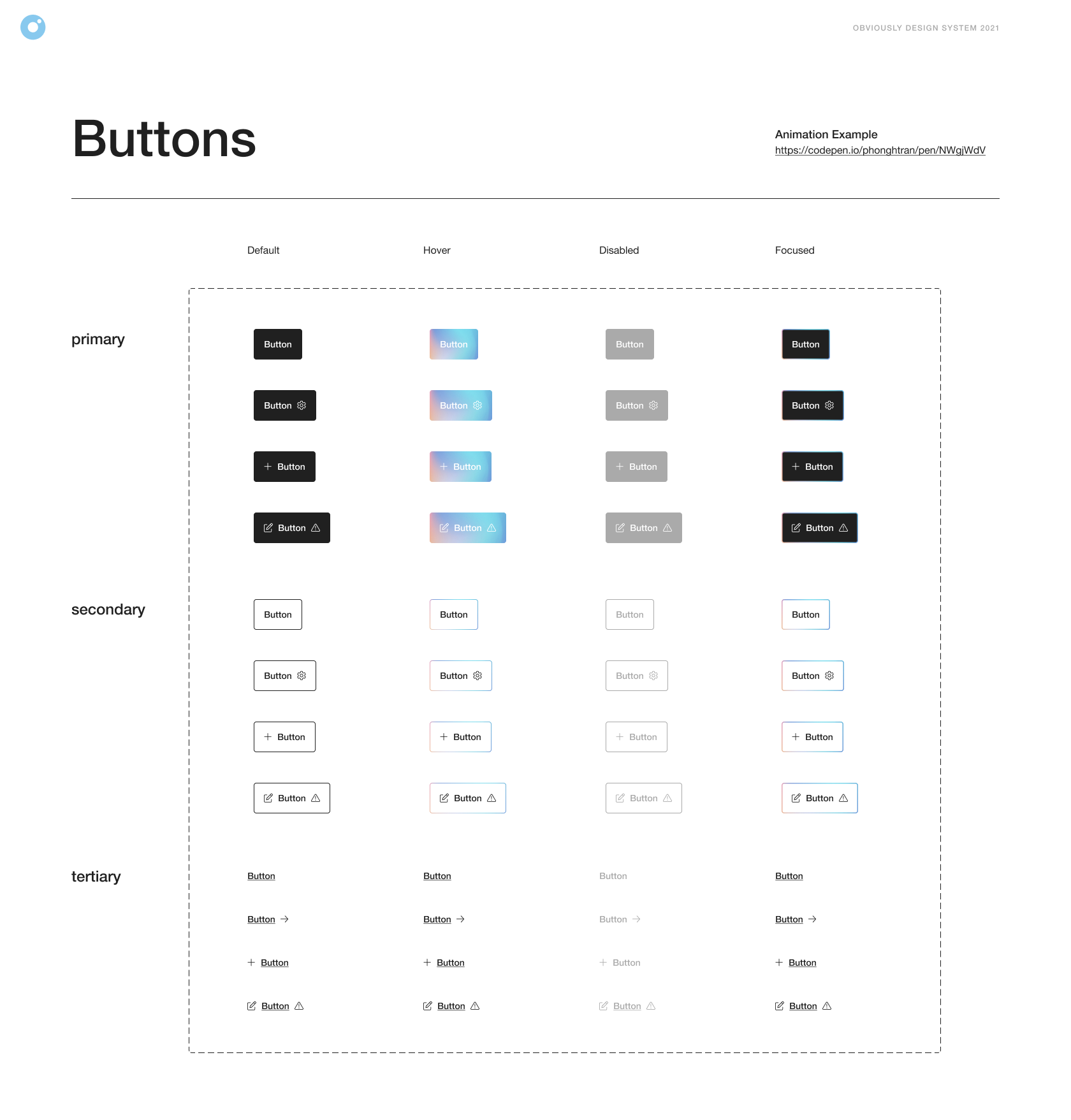
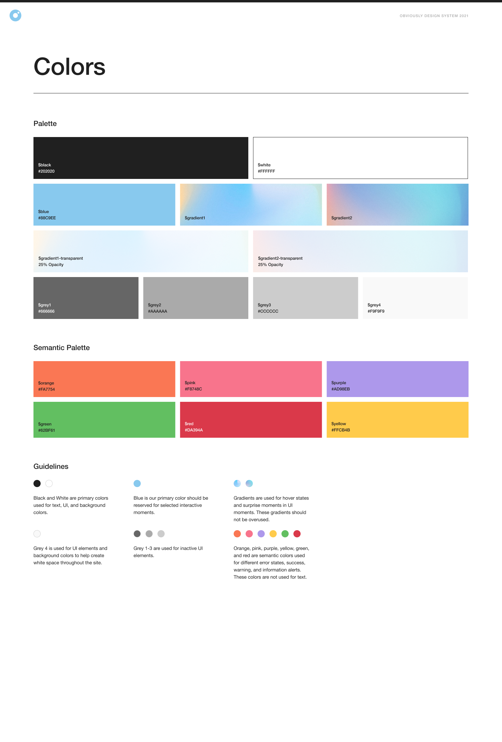
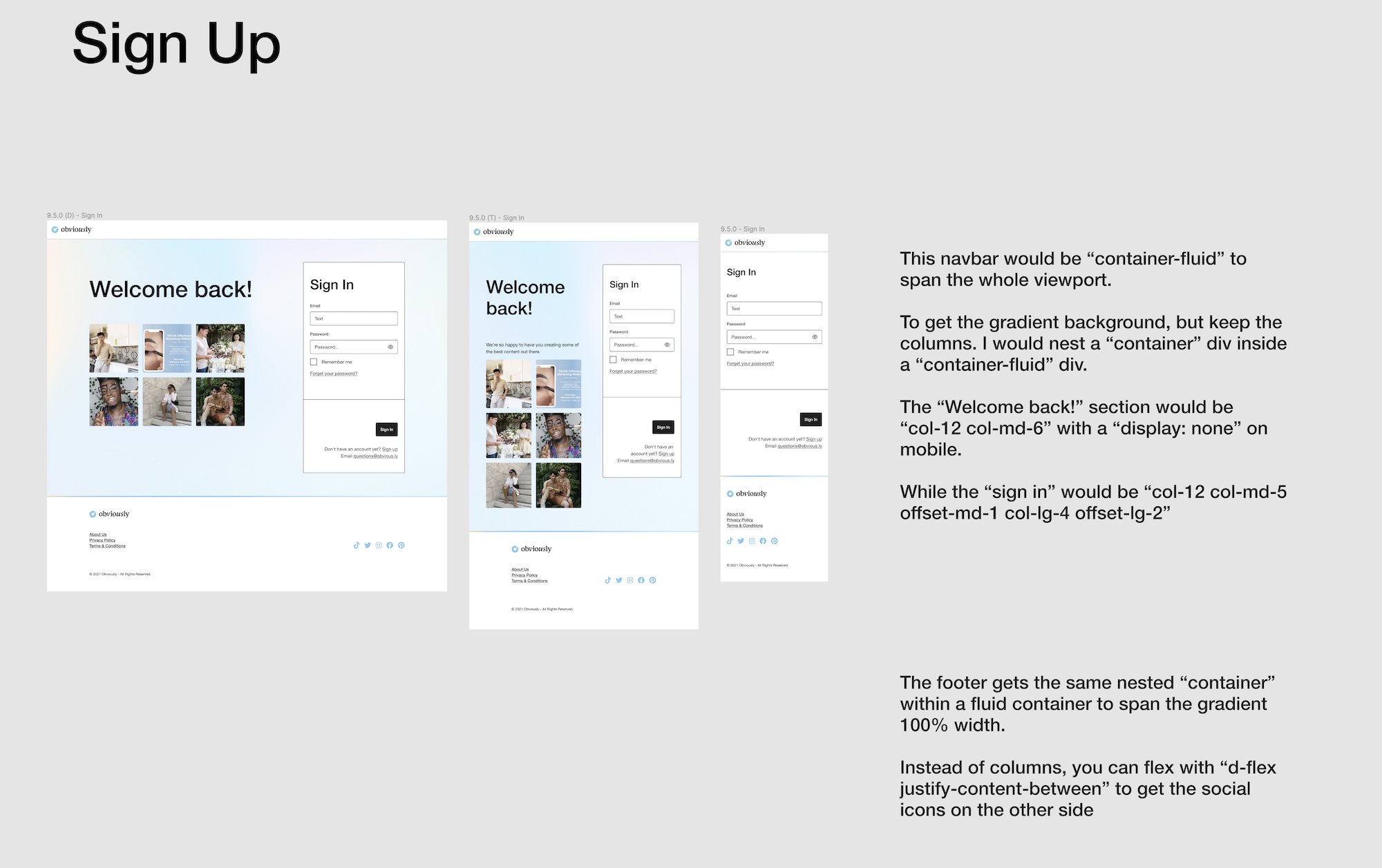
- Building a brand new Design System with new typography, colors, layouts, and components based the existing Bootstrap framework.
- Working with Product on where we could implement this safely.
- Overhauling an isolated part of the system to completely redo the CSS architecture under the new Design System
- Progressively enhancing sub-system by sub-system until the transformation was complete.
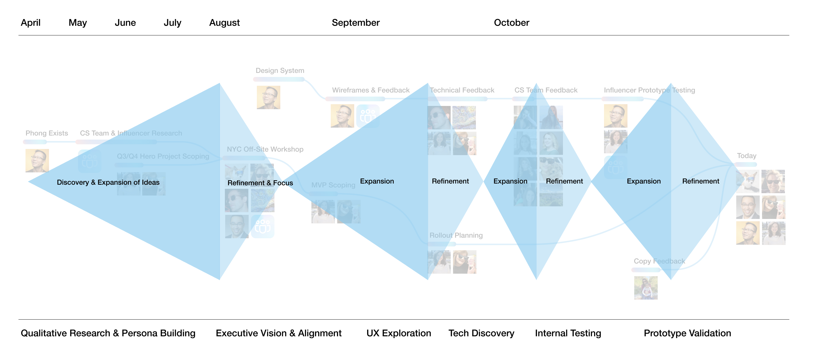
Workshops & Design Thinking
Virtual & In-Person
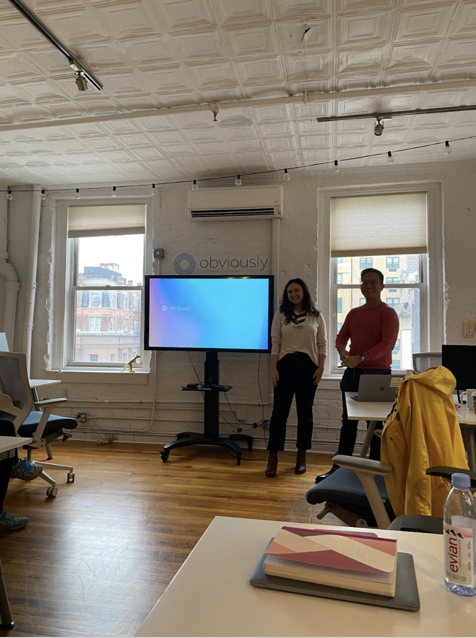
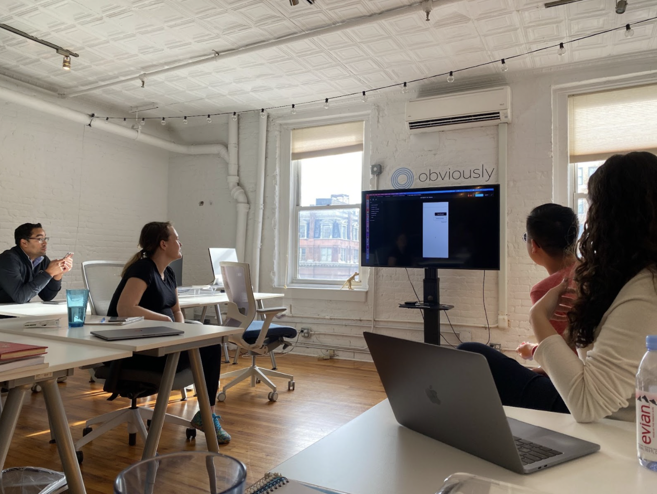
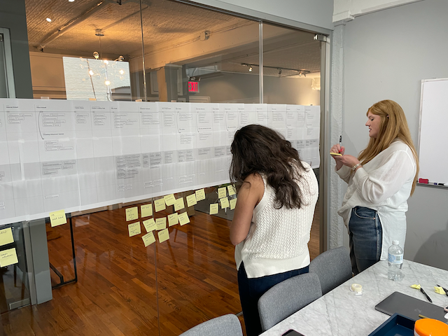
As the solo designer, I facilitated over 20 workshops. Not just for design but for executive leadership decision making, internal processes, and restructuring departmental teams.
I would leverage Miro (virtual white boarding) since we were a remote-first company. But would get to use traditional post-it notes and sharpies for when we met in-person.
Outcomes included quarterly roadmaps, new service workflows, and new products for the sales team to promote. Sometimes it would be as simple as getting alignment and consensus around a business problem.
Complete Rework of Design Research
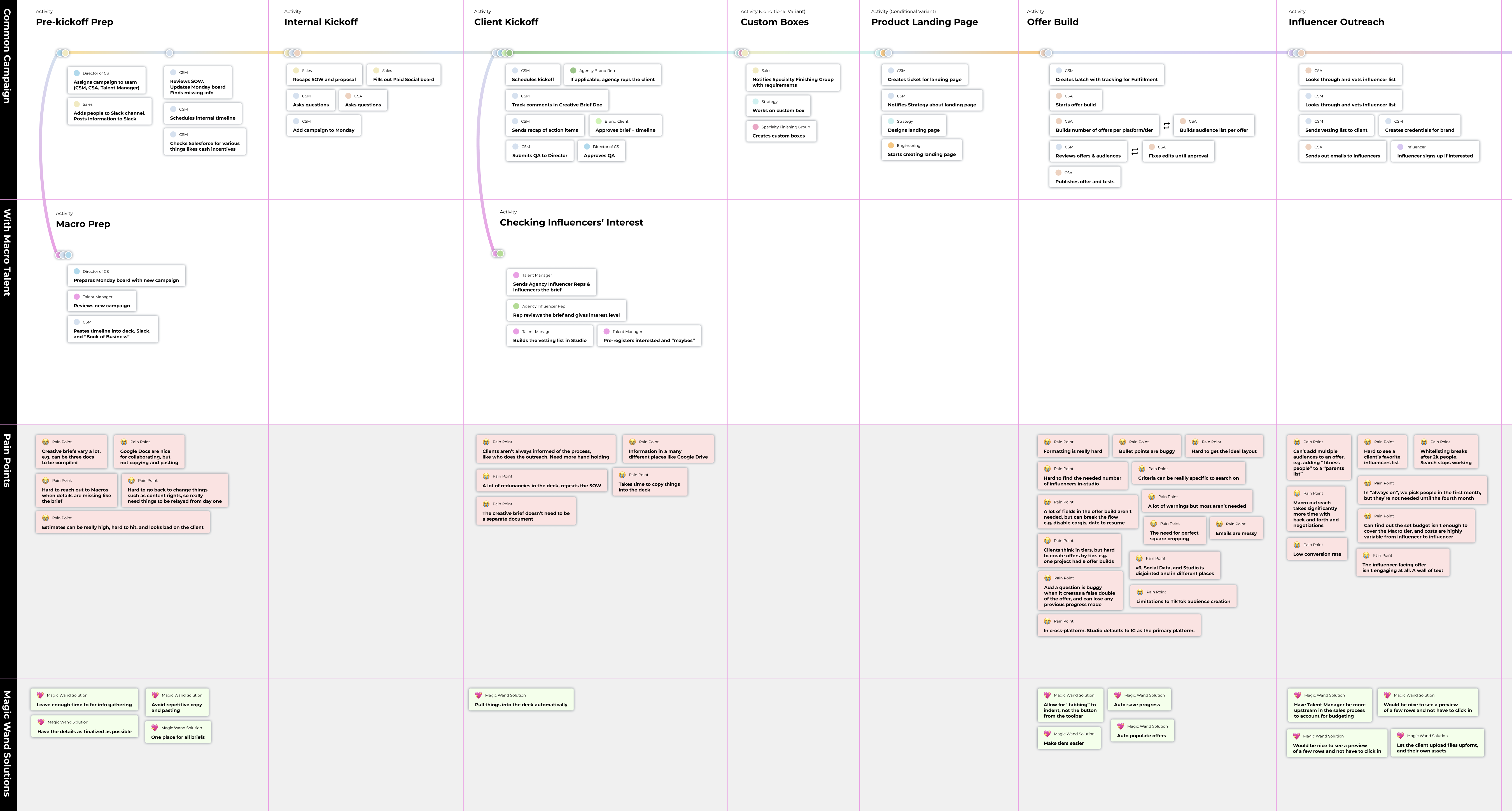
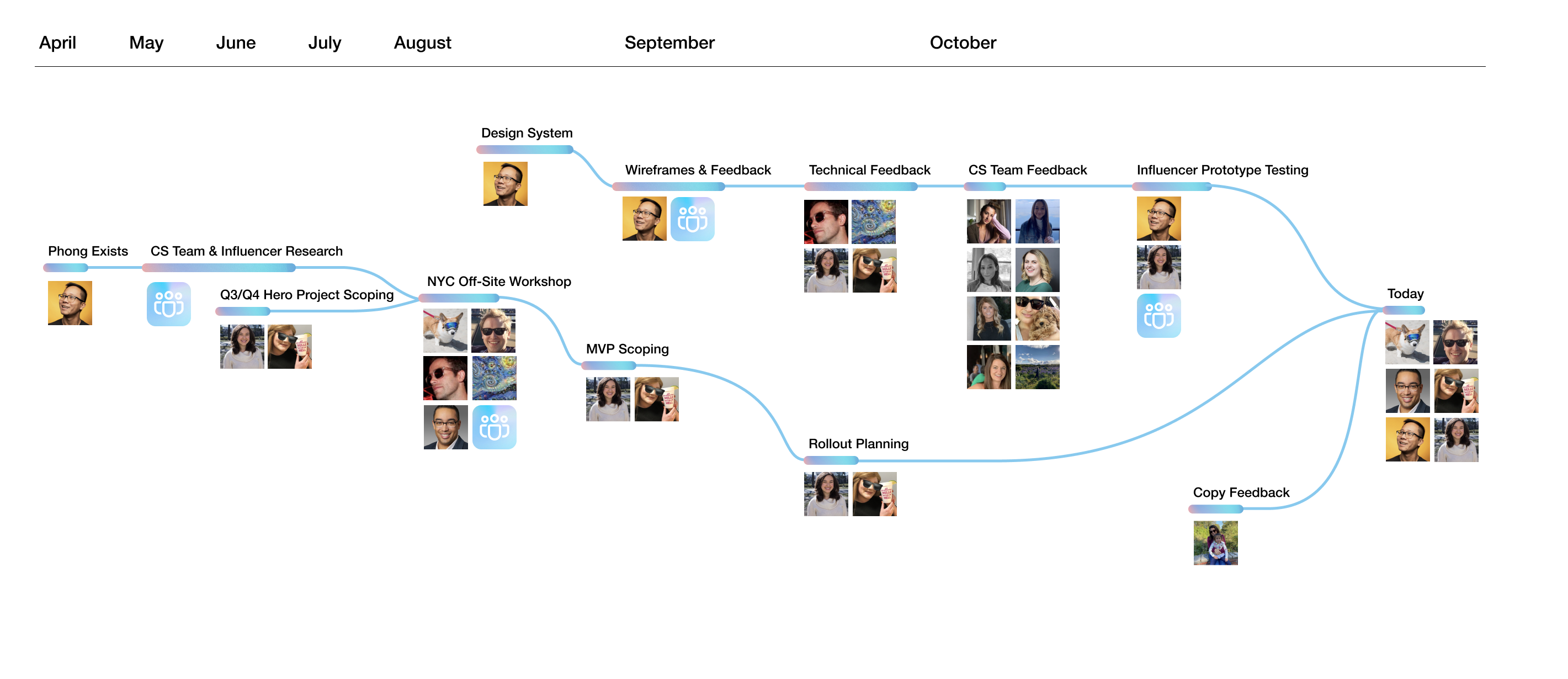
Part of the rebuilding process was to refresh everything that the company thought it knew about its users and customers. This involved dozens and dozens of interviews with internal users, influencers and clients.
Moving forward, we would institute:
- User Personas
- Buyer Personas
- Prototype-based testing
- Design Sprints
Recent Projects with Obviously
Efficient Workflows with AI & Automation
In efforts to scale up to ever bigger campaigns, I worked with Product to do a complete audit of the entire execution process from pre-sales to campaign reporting. This led to assessing over a dozen tools and vendor calls. Experimenting with tools and blending it with our data, I was able to spin up a rapid brainstorming process for campaign concepts. The main project would be to iterate our software platform for better notifications and automated reporting to reduce the amount of micro-management our teams were doing.
Design Ops
Working with Engineering, we instituted several changes to the Design-Engineering hand-off to include looms and sample front-end code. For every JIRA ticketing involving designs, I inserted a Design QA step to make sure every design was implemented correctly and was mobile-responsive. Separate tickets would be filed as low or high priority to not block the overall sprint, but still catch the errors. As overall internal visual design needs grew with client-facing materials, I built up a JIRA-based design request flow to manage the demands.
Marketing for Us
Historically, Obviously only leveraged PR interviews and paid SEO for marketing. Later on, when UX and software efforts were under control, an internal team was ramped up to handle more extensive marketing efforts. I updated our buyer personas, oversaw our team’s analysis on our corporate site and leads generation, and helped organize a marketing plan based on specific products we sold as opposed.
Acquisition Transition
While I was at Obviously, we were acquired by a global advertising conglomerate. This transition required a rapid expansion of our visual language to account for our new partnership and ways of working. In addition, working out how we interfaced with our parent companies’ clients via their various forms of relationships.
Project Details of Design Process

Styleguide

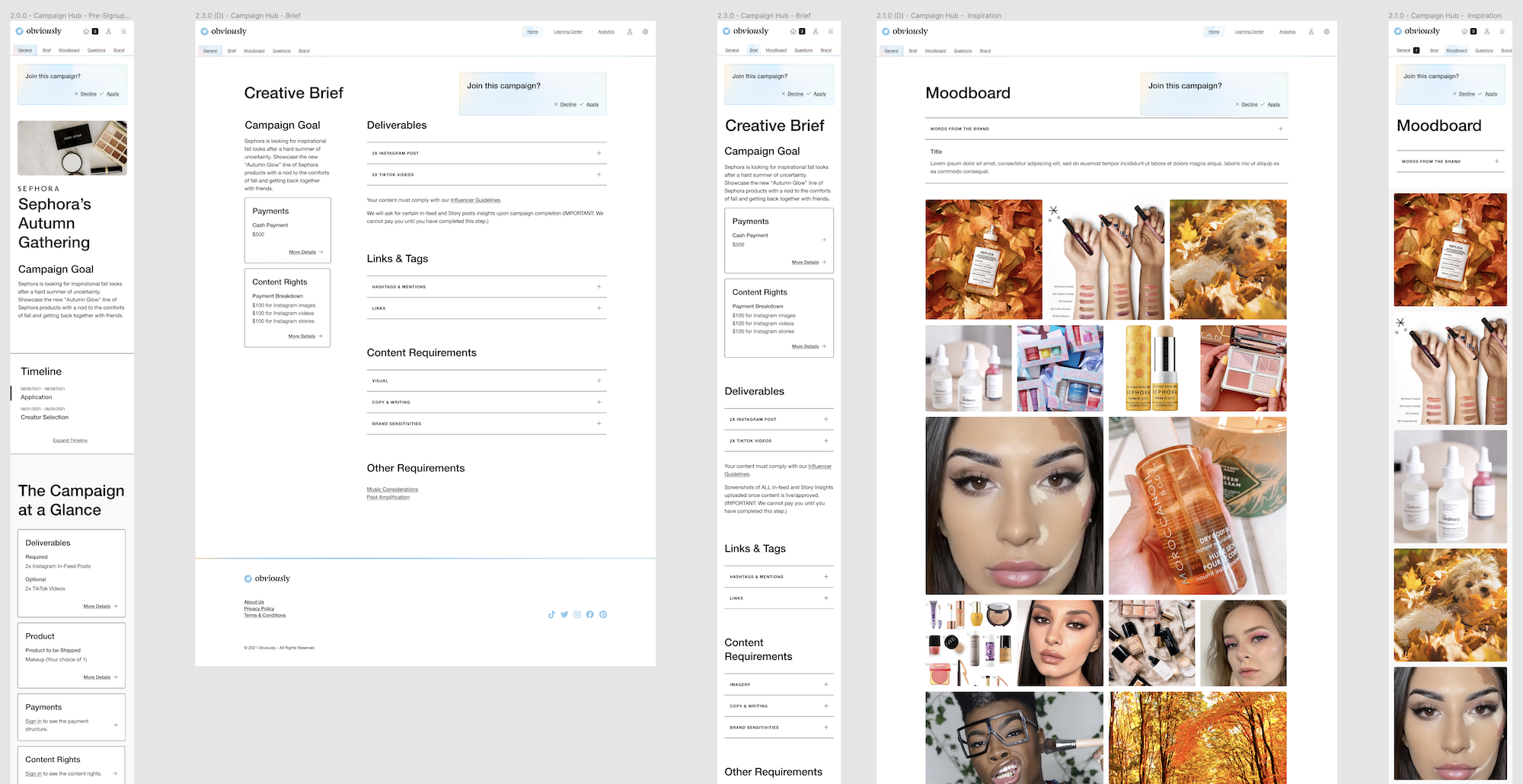
Redesigned Pages
Presentation of Project
